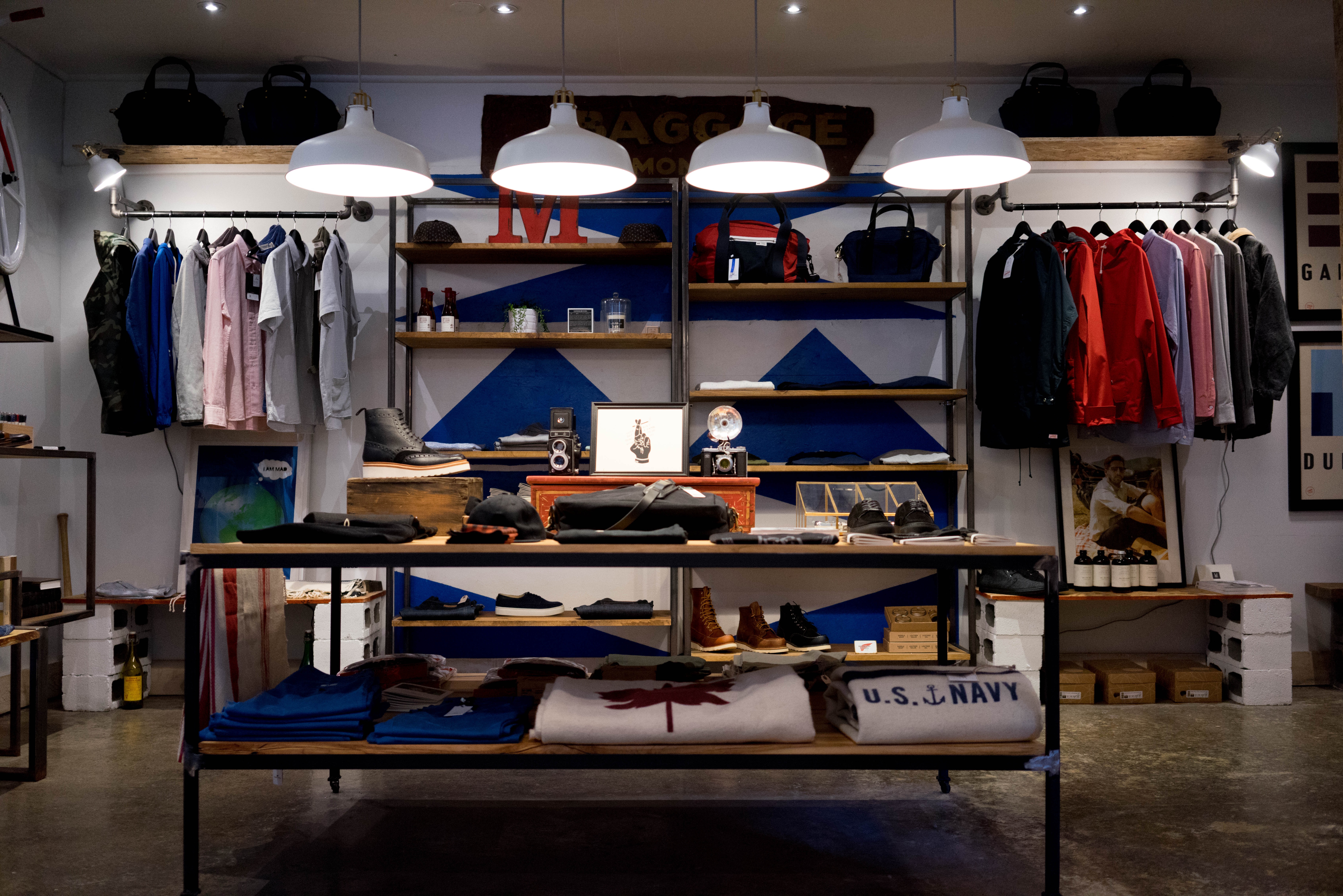
Ever wonder why women love “retail therapy”? I have. I’m not a big shopper, and yet I find myself drawn to a well-laid out retail store just for stress relief and some visual treats of rows upon rows of neatly arranged stuff to rest my eyes on. Regardless of whether I buy or not, I always leave feeling better: about myself, my future and the world in general.
Contrast this with my typical interaction with a financial services provider – individual mileage may vary but the bottom-line is that the best I can usually hope for is that I leave without permanent scars, figuratively speaking.
Yet, the financial services industry has plenty of unmined gold, if it takes even a cursory look at what retail gets brilliantly right about customer engagement, at least in the store.
Five secrets behind the lure of retail therapy:
Here then, for the first time, are the five secrets that make retail therapy reliably attractive to their prime customers regardless of budget, macro-economic conditions or the current state of the industry.
Creation of friendly familiarity and comfort
When you walk into a retail store, the first impression you get is one of friendly welcome. The store attempts to make it easy for you to know what’s available in an easy-to-digest manner. They don’t hide all their good stuff away or present them to you in terms they use to manage their business.
Everything is presented in user-friendly terms, and yet in categories by use or by type of customer. Assistance is available, but the merchandise is laid out in a way that assumes the customer knows their way about. In other words, the first emotion that is sparked upon entry, is a feeling of familiarity and being welcome.
Attractive visual end states to inspire thinking
If the customer doesn’t know exactly how to use some of the merchandise, the store provides a starting point by putting ensembles and collections together to spark their imagination, and gives them a jump off point to create their own happy future states (e.g., with that lovely outfit).
This provides a fall-back option of what to buy if they are completely clueless about a product or look. Most importantly, it creates a vision of a better self and a brighter future with themselves in it, that didn’t exist before they walked into the store.
Self-directed path and pace
While the layout of a retail environment is very carefully designed to nudge the customer to certain areas or along certain paths, the customer is always left with the option of directing his or her own path , as well as the pace.
Some might make it to all areas . Others might just make it part of the way through and leave, with or without a purchase in hand. All the selling is done by how the offering is arranged, and by other behavioral prompts that are designed to trigger purchases.
The customer feels free to wander and explore at their own pace, with multiple paths, options and ideas to trigger imagination and a sense of possibility.

Reduction or elimination of clutter
In the better retail environments, clutter is reduced to a minimum or eliminated altogether, to focus attention on a few high-value offerings. This reduces mental and visual stress, and increases the chance that a purchase happens, because there is little else to distract the customer at that moment of decision.
To many women whose lives are otherwise a tale of constant overwhelm and clutter, this white space, both physical and mental, offers a huge and much-needed respite from the cares that they otherwise can rarely set down.
Relief from everyday stresses and overwhelm is highly valued, while still allowing them to go about the business of doing what they came to the store to do.
Curation and arrangement by themes
While a retail store may offer multiple categories of products, careful and selective curation of multiple categories into well-thought out collections is a huge part of what triggers a purchase.
The human mind naturally seeks to categorize and bundle things, both for the sense of order and comfort this action produces, and also for reducing the cognitive burden of remembering a dizzying number of possible product ideas or suggestions.
Creating means and artifacts to reduce cognitive load of the task is highly valued.
Investing and wealth management, re-imagined
Now imagine if these same principles were used in creating a stress-free and confidence-inducing experience in an investment or financial setting. What would that look like? The specifics for each vertical or provider may vary but all of them will share these common features that leave the customer or prospect feeling and being better off:
- The experience evokes a sense of familiarity coupled with an invitation to explore. This can be as simple as the difference between having a sparse office with only cold furniture on display and putting together themes or ensembles of client types or financial goals that the firm can help with, for example.
- They have been presented new possibilities or visions of a new future in which they can credibly see themselves participating, to their benefit. Examples: blurbs of testimonials of specific goals attained (career flexibility, kids successfully graduated college) that go beyond the tired visuals of the silver-haired couple walking hand-in-hand on the beach. To truly stand out, the firm can even highlight nontraditional client types that have successfully accomplished a goal or solved a problem (for example, single women).
- They can choose the paths and the pace along which to proceed – but assistance is available when and where they need it. The way to do this might be simple: provide thematic paths for different types of clients , with a sampling of what the actions and path might look like. Highlight differences in investing styles, financial situations, or level of involvement in the management of their own finances), to give potential clients a sense of possible paths and an opportunity to evaluate where they stand in each of these spectra. For many clients, this may be the first time they ever stopped to think about these important questions.
- Products and offerings are presented without clutter and in a way that allows the customer to absorb, evaluate and try on for size , without pressure and without the glare of a salesperson pressuring them to buy. For example, three model portfolios (with the appropriate disclaimers, of course), that three different types of clients might prefer.
- Rather than individual products, offerings are put together into themes or collections that gives customers information and ideas on how best to use these products to get the most value out of them. The model portfolios example above will work here as well. In addition, a provider could also rotate themes by week or month, with a focus on a specific product or strategy each month.

How to get started making finance fun for women:
To get started, a provider needs to start evaluating their current offering with these five lenses in mind:
- The lens of emotion: What emotions does the current offering spark? Are these positive or fear-based? What will be needed to transform these into confidence-building responses and reactions?
- The lens of possibility: What possible future states does the offering suggest or evoke? Are these varied enough to appeal to a much wider variety of customer profiles, needs, priorities and values? Are they realistic enough that customers can see themselves in these visions of a possible future? What can be done to offer more exciting or hopeful visions of possibility?
- The lens of control: How much control does the current offering give to the customer to direct their progress? There is of course, always a creative and healthy tension between giving them freedom to move while also gently encouraging and prompting positive action. However, there is usually much more room to play on the control side than providers currently use.
- The lens of focus: How much does the current way of doing business allow the customer to focus on a few key themes, issues, products, or even steps in a complex purchase process? To what extent can the provider support their customer’s journey by only presenting what’s important, relevant and needed at the right moment?
- The lens of cognitive efficiency: What is the provider doing to reduce cognitive and decision load on their customers? Of the five lenses, this is likely to be the hardest to answer and implement, given the nature of the products and services in question. But it is also the one that is likely to yield the highest rewards because it is the area of greatest pain, greatest need and the greatest differential between men and women when it comes to financial matters (for more details, see my post here).
The process will be iterative and ongoing, and will evolve as the business gains an increasing understanding of what its female customers want, and also as these same customers evolve and grow over time.
For any provider who wants a share of this lucrative niche, heeding the lessons from the success of retail in drawing customers back again and again is likely to be a winning strategy.